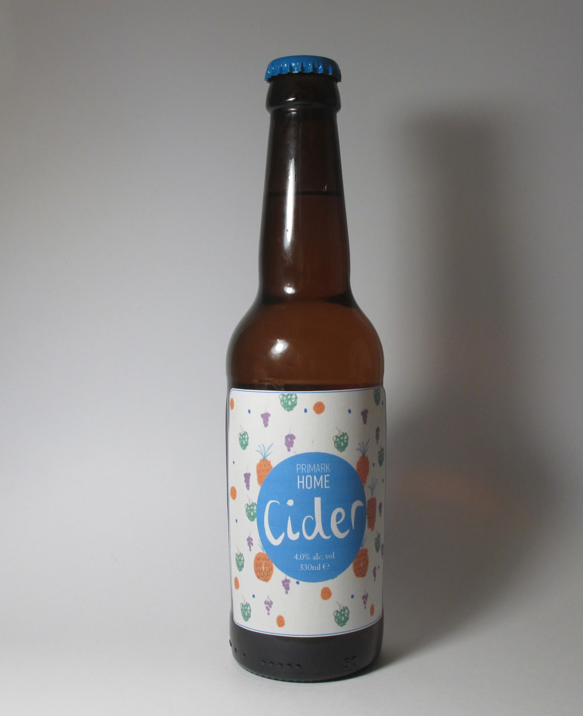
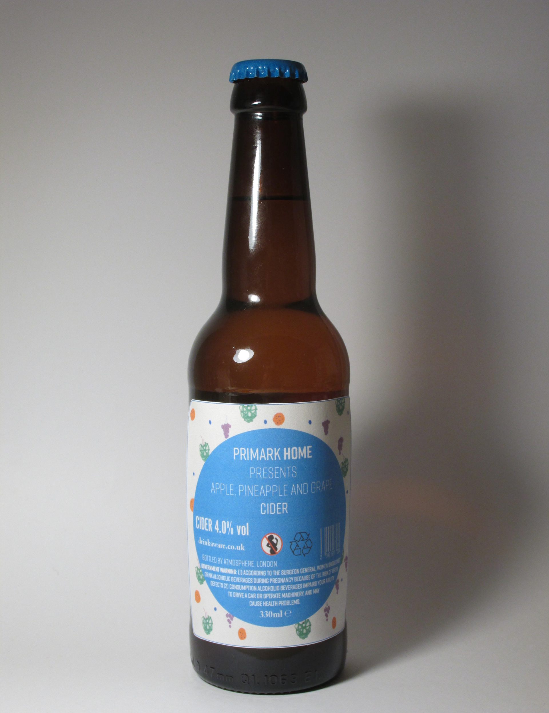
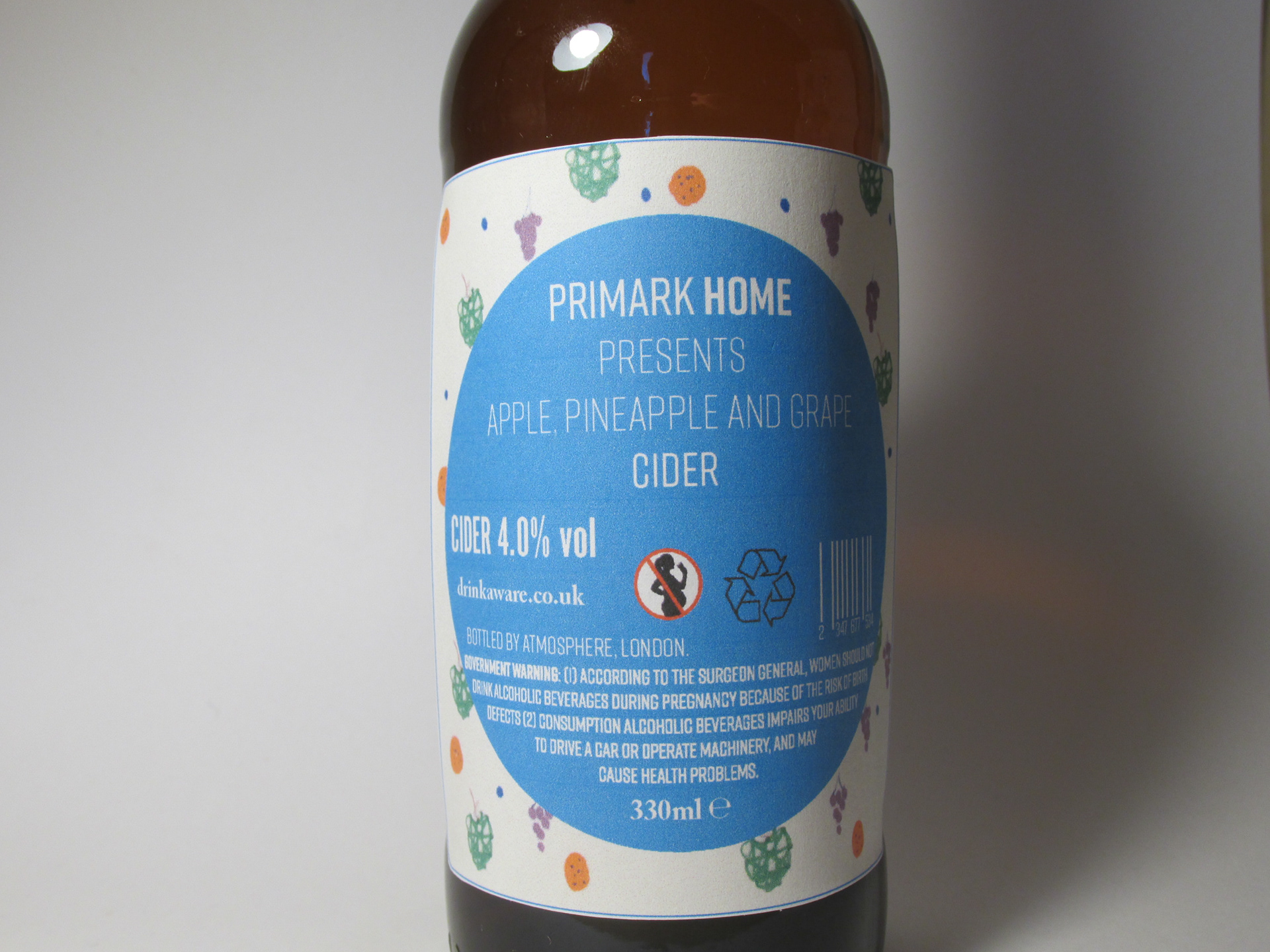
For this project, I designed a Cider label as if Primark had produced it, adding my own twist too.
Through my research, I found the sewn label messages found on two dresses from Primark about the terrible conditions workers were working in as well as producing clothing in Sweat Shops in 2013. I thought I would illustrate this by including sewing into this design. This demonstrates that we only look at the product and the price, not considering who and where it was made necessarily. Primark does not have the most appealing past due to this yet people still buy their products because they are cheap as I found in a survey I held.
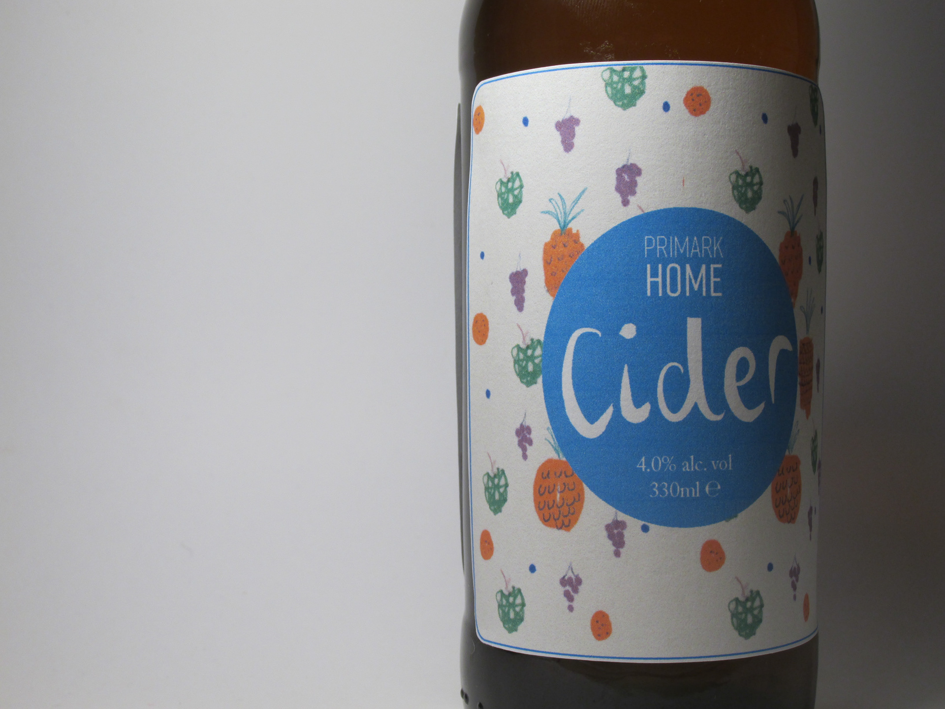
I decided to have the label as a sticker to replicate the Primark home labels stuck on their products. The label is also squint as Primark does not necessarily consider presentation, as my survey showed that a majority of people found Primark untidy and messy as well the quality not being satisfactory.
The large blue circle in the middle of the label illustrates Primark's colour as a majority of people stated that they recognised Blue with Primark.
I created the Cider type myself and I used the type Rift for 'Primark Home' and the government information on the back of the label. For 'Cider 4.0% Vol', I used Alternate Gothic No. 1 because it is very similar to Rift. The type for the measurements of the bottle on the front of the label and the alcohol as well as the Drink awareness link is in Adobe Caslon Pro because it's sophisticated and similar to the type used on Alcoholic beverages.
I added a grain texture to create a recycled paper effect referencing their brown Primark bags that have been recycled.

