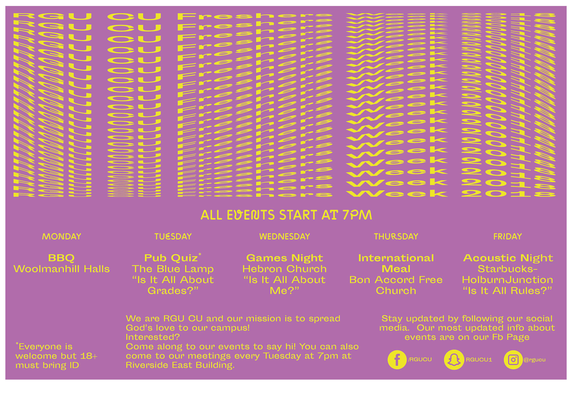
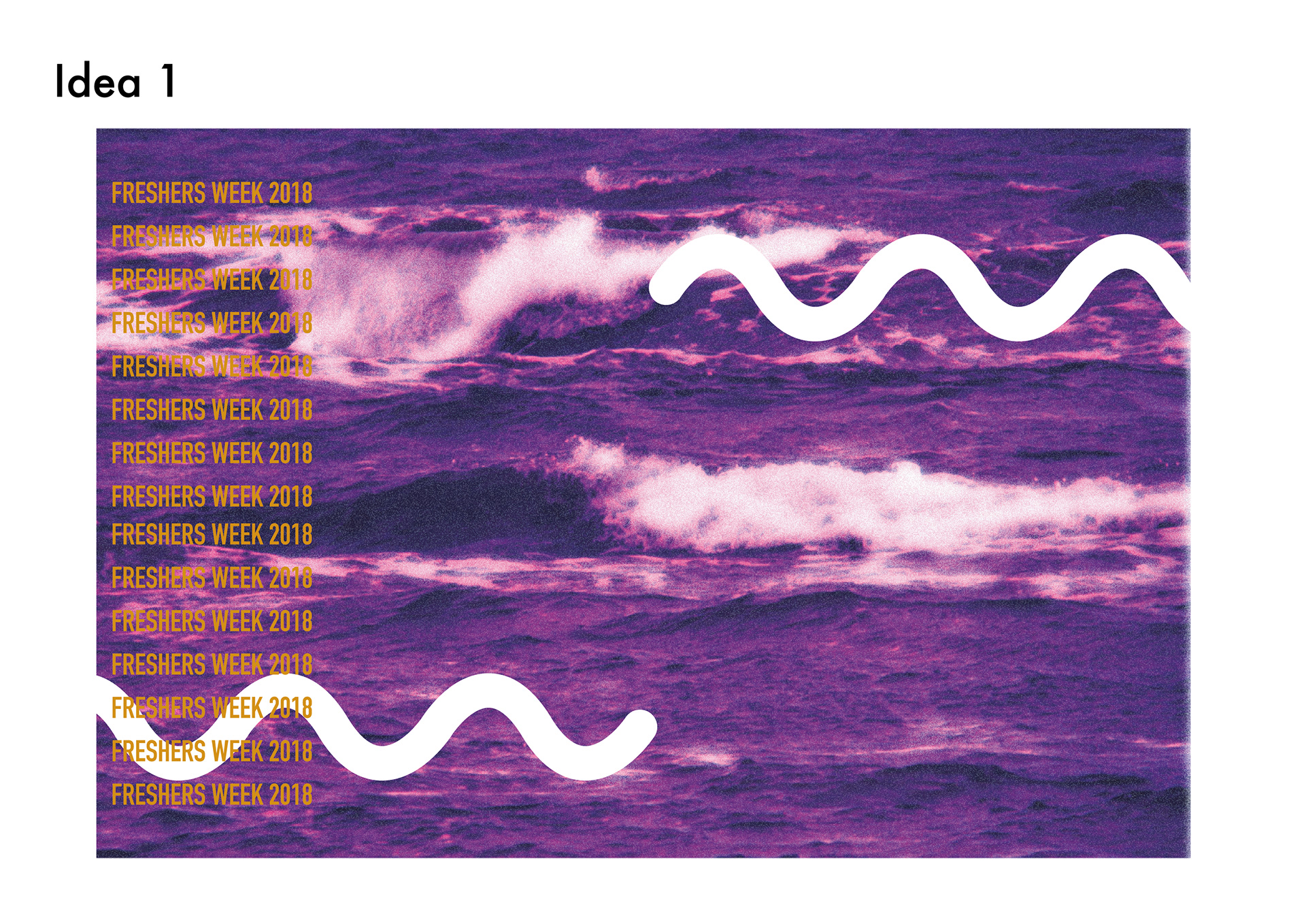
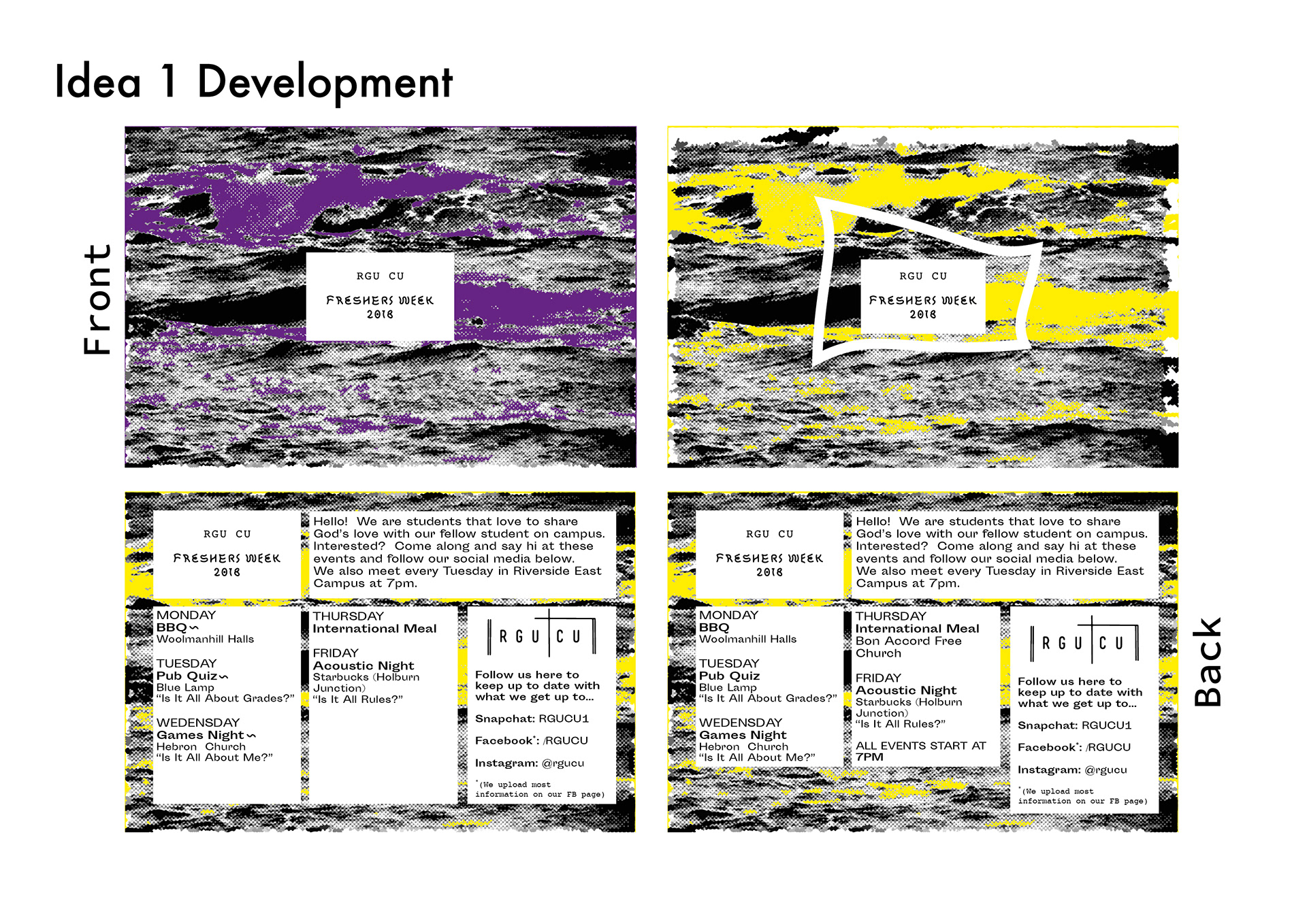
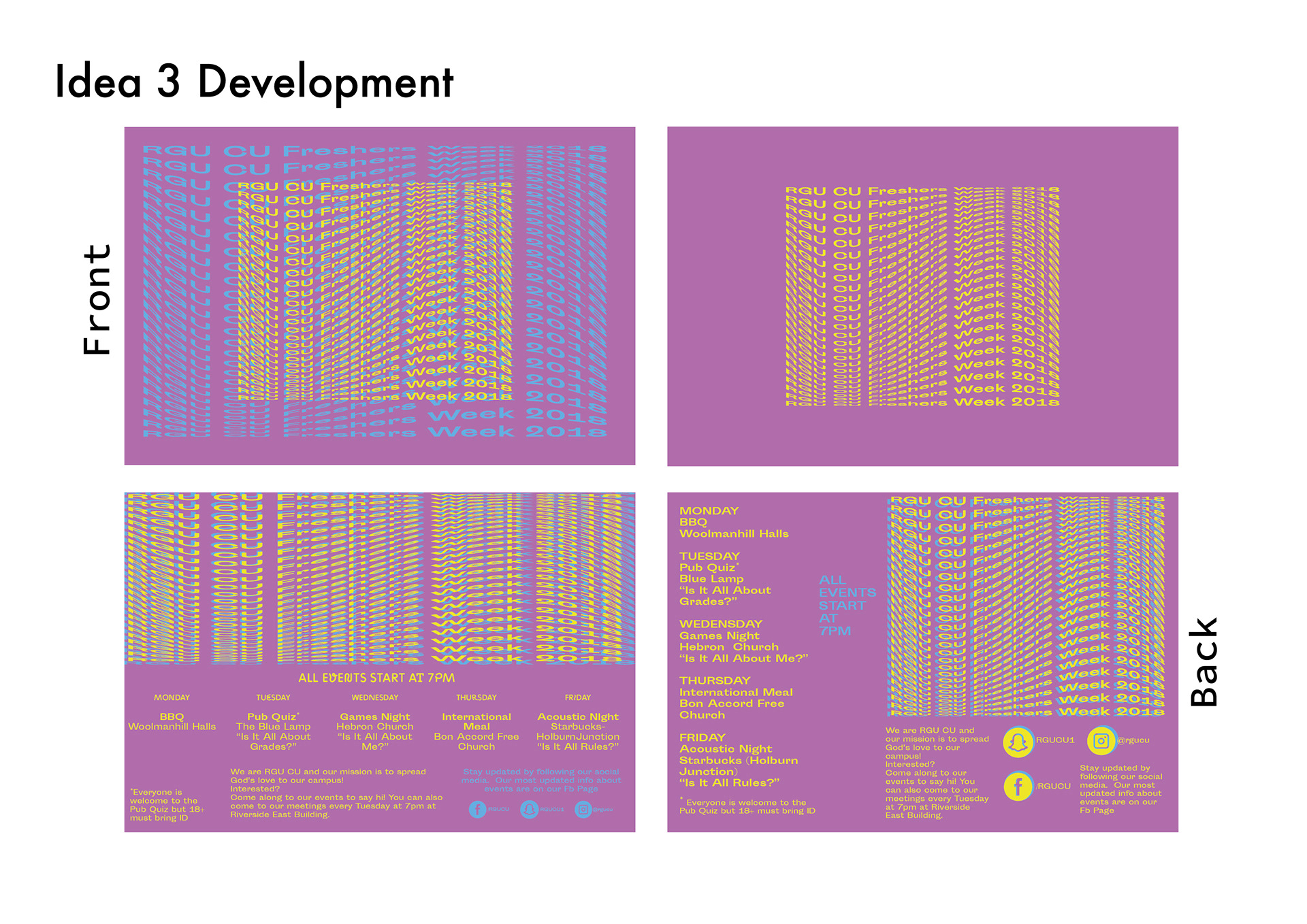
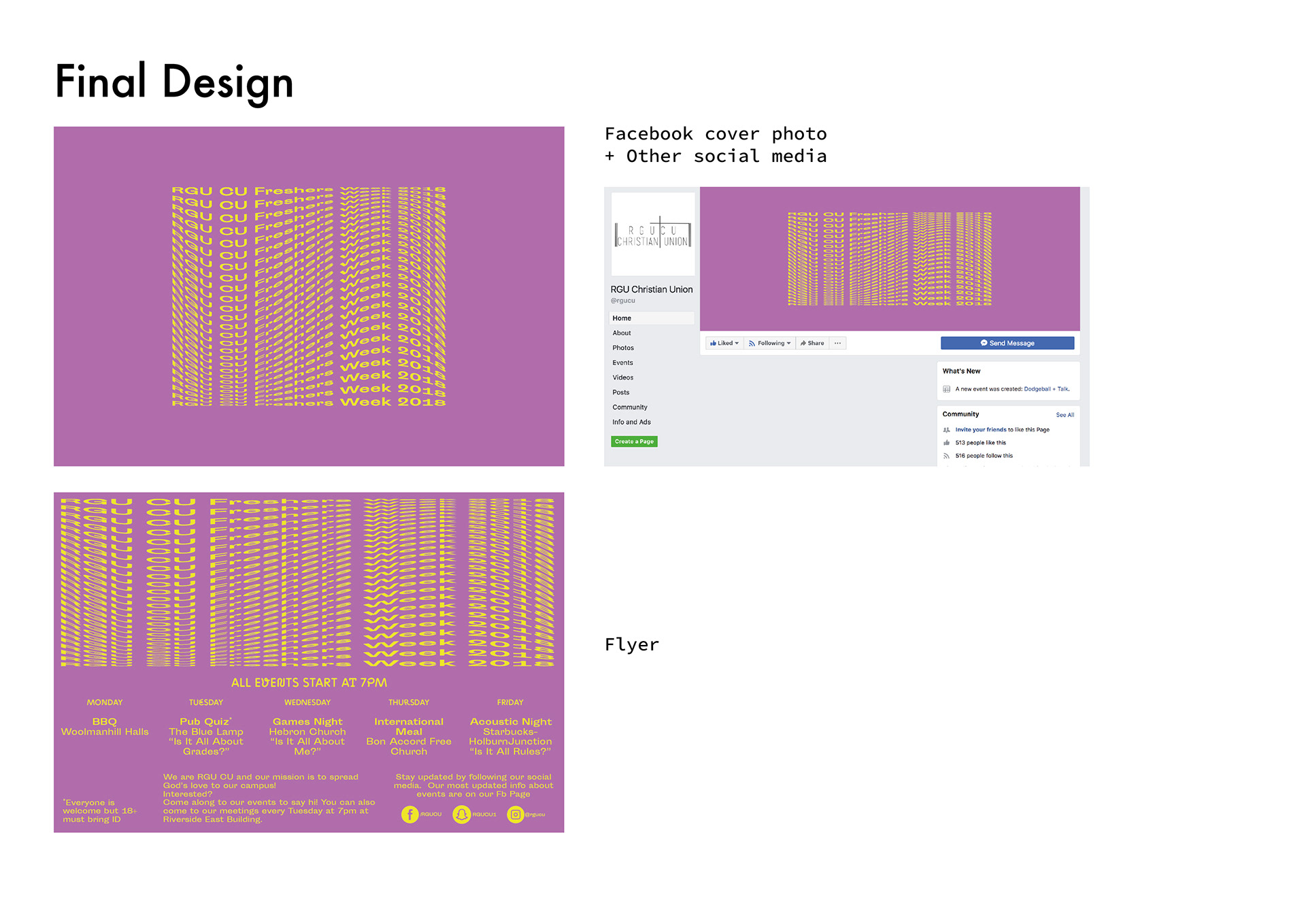
I was asked by the client to create a flyer that is eye catching and young. I created this design with the purple from the RGU logo and a yellow creating a contrast which hits eye catching in the eye. I used Zigzag because of the youthful, fun feelings created and Sporting Grotesque so the information is formal however, still interesting to the eye.
I used a wave effect above to illustrate the highs and lows of university, it can be quite a shock to some people.