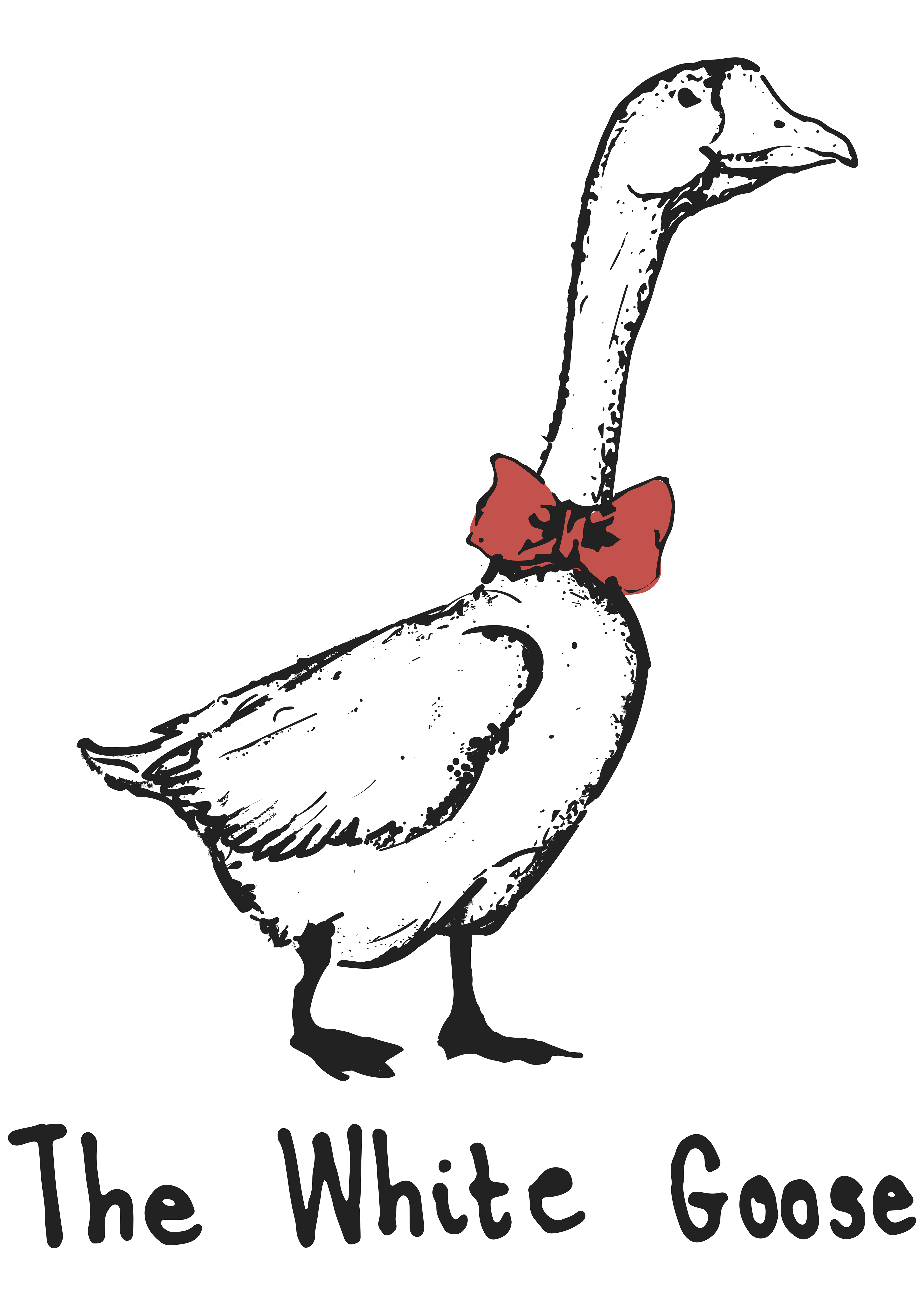
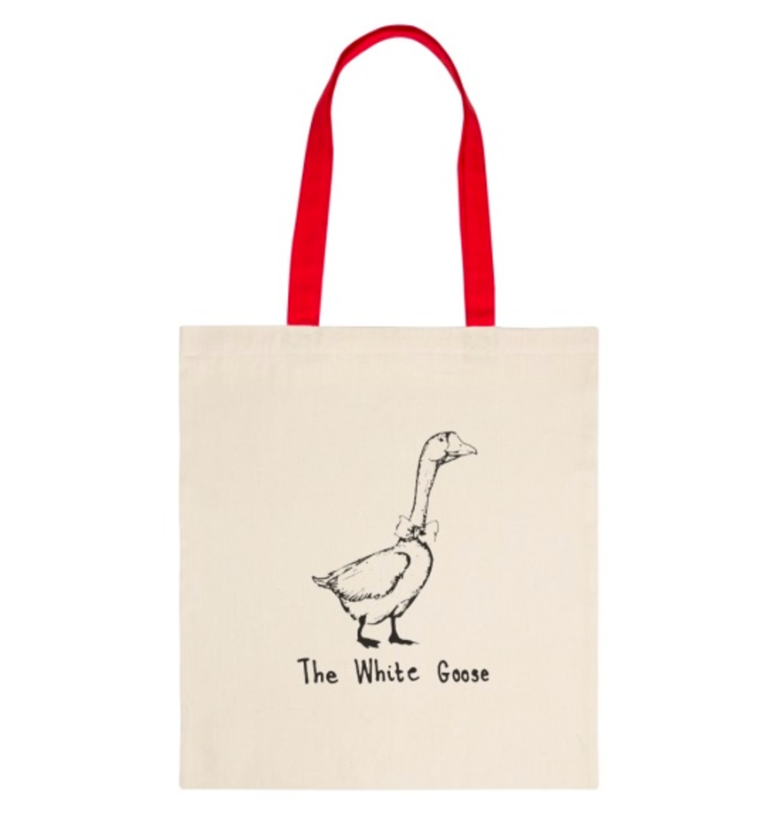
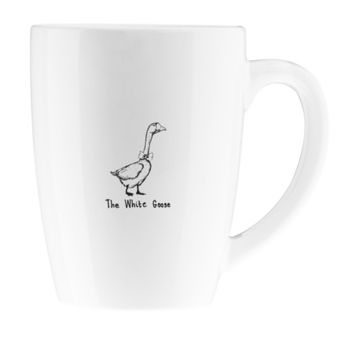
The brief given was to create a logo which was delicate but simple.
The White Goose already had their eyes set on the image of a Goose with a red bow tie for their new Restaurant, Cafe and Bar. I came up with some alternative ideas, from a simple line drawing to a more detailed drawing which I then scanned and placed into Adobe Illustrator. I also tried a minimalist style working with shapes and negative spacing but the idea which worked with the clients best was the simple line drawing which is what they had in mind.
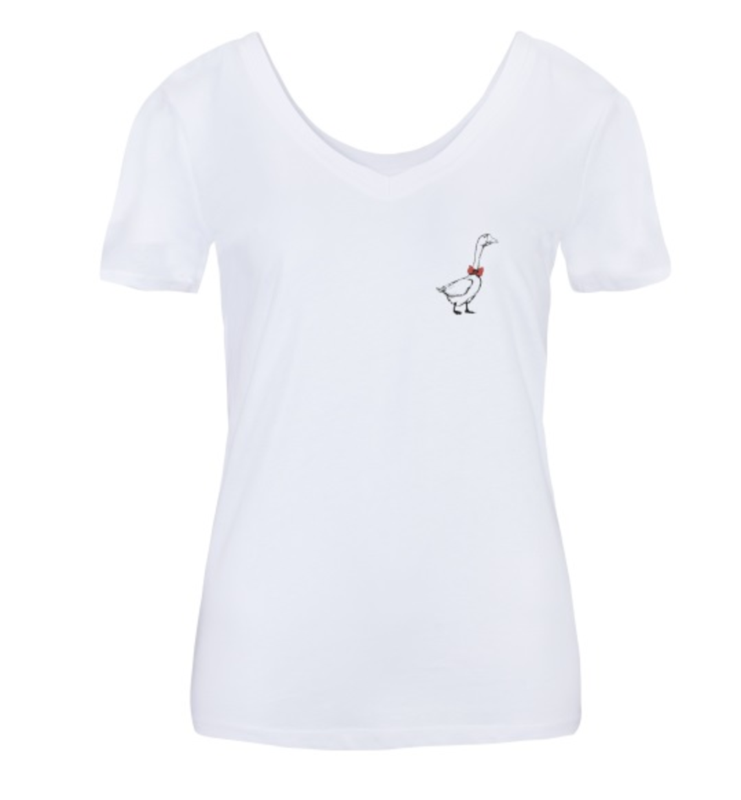
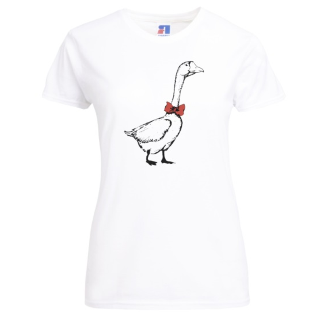
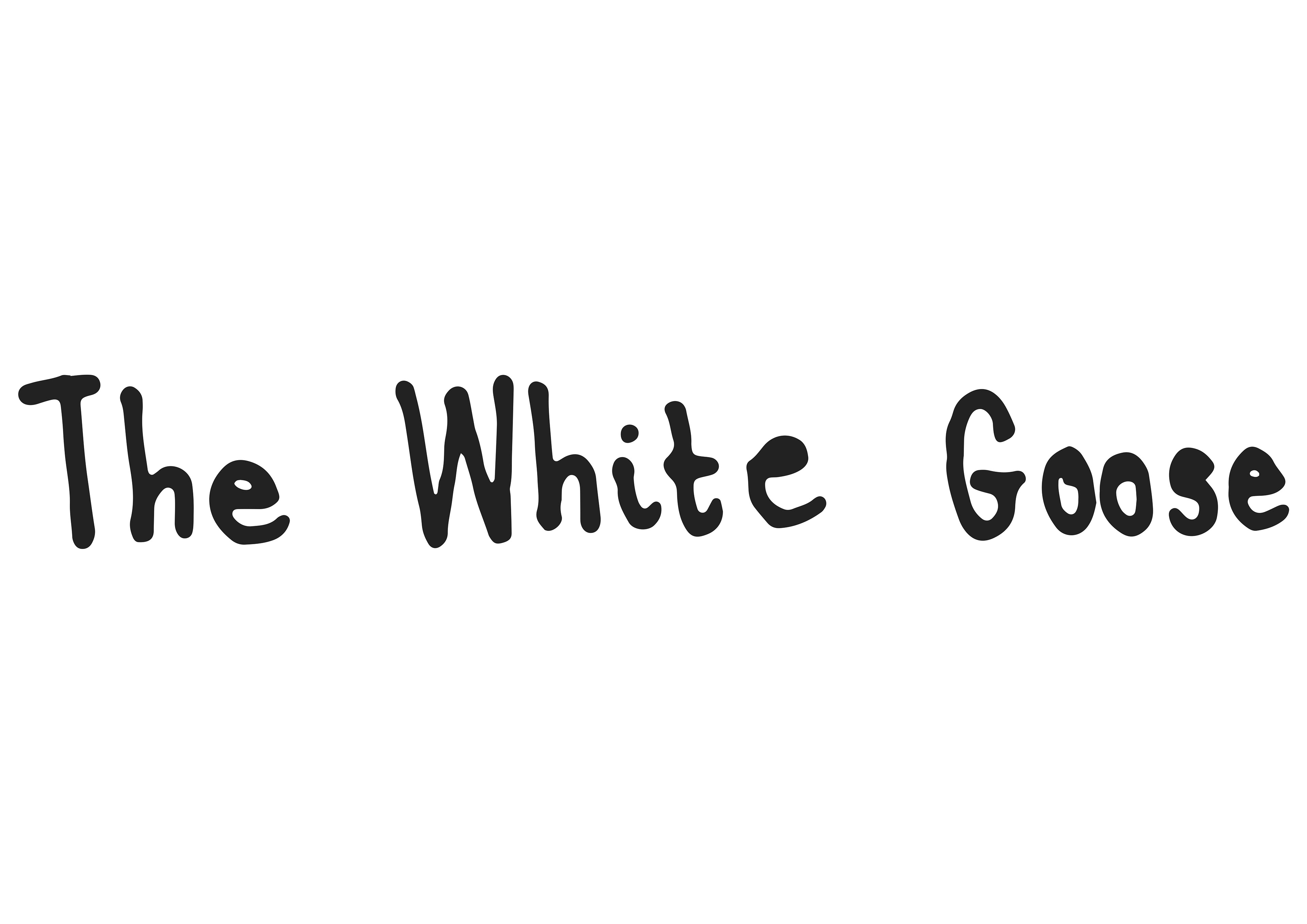
I developed the idea more to finally reach the final logo design which is the above. I also tried out some type ideas and they loved my hand writing versions. I think it works really well with the hand drawing logo; it adds an authentic and welcoming feeling towards the logo.
They were great to work with and I feel very privileged to have been chosen to create their brand. I wish the very best for them in the future.
